
Mobile-First Design: Creating Responsive Experiences
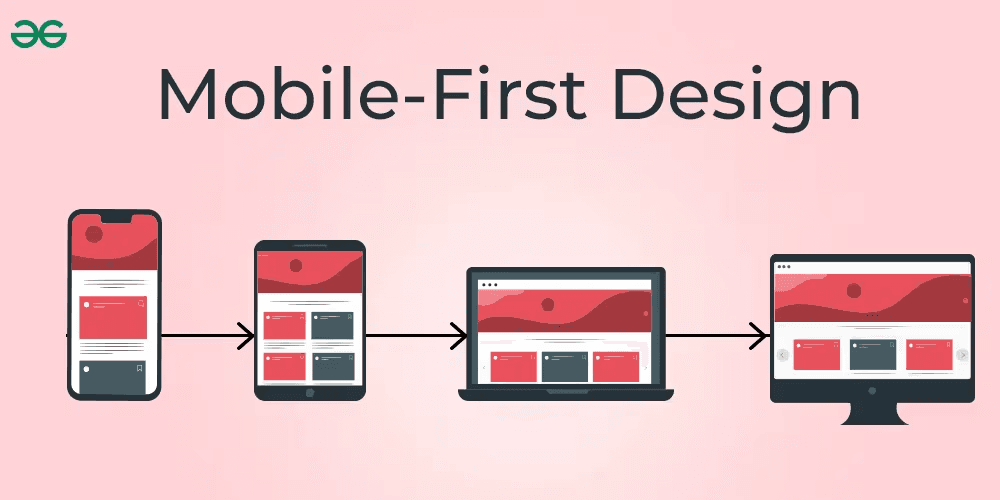
Mobile-first design isn't a trend — it's a necessity. Learn how to craft responsive interfaces that deliver seamless experiences across all devices.
Over 60% of web traffic comes from mobile devices — yet many developers still prioritize desktop in their design workflows. Mobile-first design flips that mindset, starting with the smallest screen and scaling up. This approach ensures your site is fast, clean, and user-friendly across all platforms.
In mobile-first design, you begin by designing for the lowest resolution and progressively enhance the layout using media queries. This ensures critical content and core functionality is available on all devices. Performance becomes a priority — smaller screens demand faster load times and intuitive interfaces.
Frameworks like Tailwind CSS and Bootstrap 5 make it easier than ever to build responsive grids and layouts. Moreover, using flexbox or CSS Grid, developers can create adaptive UI components that reflow naturally across screen sizes.
A mobile-first mindset also encourages content prioritization. You’re forced to think: what’s truly essential for the user? This often results in cleaner, more purposeful designs.
Ultimately, mobile-first isn’t just a technique — it's a philosophy. One that puts the user (and their thumbs) at the center of your design process.
Never miss a post
Subscribe to our RSS feed and every new article lands in your reader automatically — no email, no algorithm.
Works with Feedly, Inoreader, NetNewsWire and any other reader. View raw feed